“We want is fast. We want it pretty.”
This is probably the adage of most internet users and social media platforms have taken note. Twitter, the micro blogging site, is set on its word count limit, while Pinterest had just recently changed its look, making “pins” much bigger for site users’ enjoyment. Facebook has also redesigned its interface to look like an infographic.
There is much focus on these websites’ visual appeal and content brevity because today’s culture is all about getting information in one glance. For this reason, infographics rose as a very popular medium for both internet marketers and for those who, well, would simply like to share invaluable information with a click of a button.
This is a great premise. Who wouldn’t want to understand and learn new things the fastest way possible? The downside is that there has been a decline in the quality of information sharing. The more discerning internet user would know that most online sources may not be as credible, but many don’t seem to mind. This is also reflected in the proliferation of design houses that aim to churn out infographics for the sole purpose of going viral.
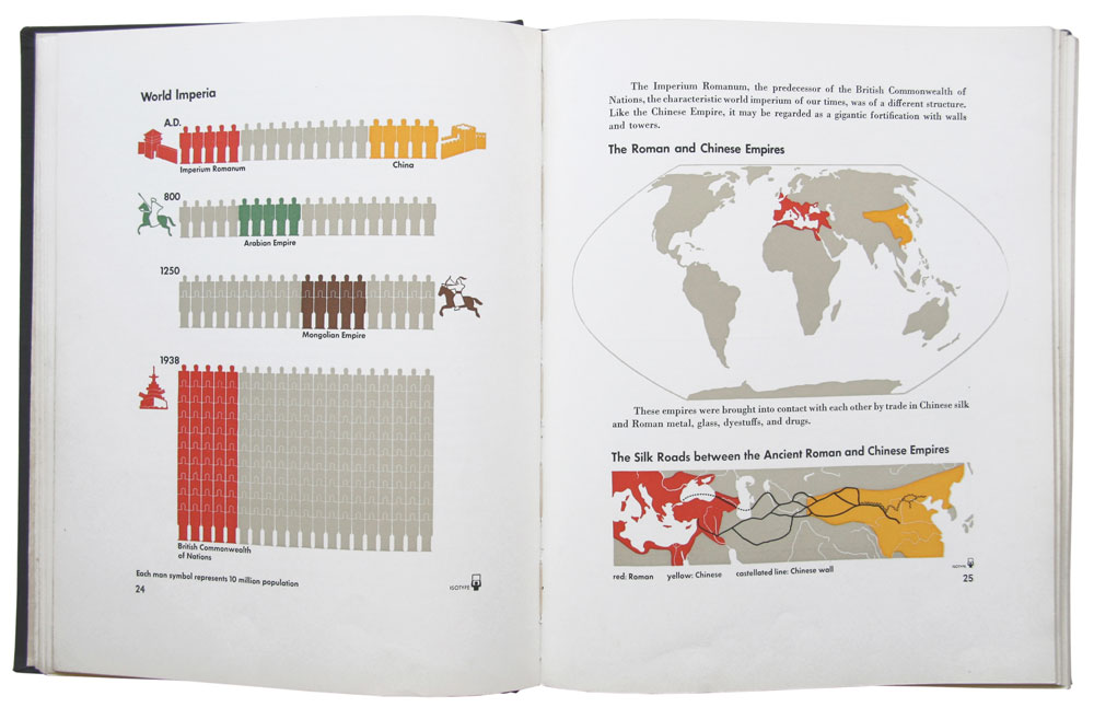
Dylan Lathrope, an LA based graphic designer, laments about the infographic’s quick yet painful death in the Harvard Business Review. Commercialization and overexposure has caused the medium to suffer. Data visualization, in essence, should be able to translate the most complex pieces of information in ways that are accessible to many, as opposed to the trend of ornamental infographics. These “fluffy” works may be easy on the eye, but bear very little informational weight. It is a departure from the elegant isotypes (International System Of Typographic Picture Education) created by social scientist Otto Neurath and designer Gerd Arntz, which aimed to educate Europe’s proletariat on important socio-political issues.
To this day, many of the 4,000 isotypes created by Neurath and Arntz are still widely used, professing the efficacy of this visual language. The internet’s popularity has brought about the resurgence of the medium. Unfortunately, most infographics fall short of presenting data or telling a proper story. It has also evolved into a more interactive type of data visualization called “webgraphic,” the difference being the interactive element added to the visuals.
Webgraphics, while integrating the element of fun through a series of graphic elements and data, are mainly used for monetary conversions as a platform for advertising. Data is sparse and there is too much of design in most cases, as opposed to a well-made infographic, which manages to communicate a wealth of information in the simplest possible way. This isn’t to say that webgraphics has no potential as a credible means of disseminating information; there’s just a need to recognize the ways on how this new medium can be developed properly. The same thing goes for the modern infographic. Internet users must look beyond visuals that are click-worthy and see the value of an infographic that actually manages to help people interpret data effectively. Hopefully, this appreciation/discernment will lessen the proliferation of internet drivel and leverage the web’s feature of being everyone’s information hub.


